Website Redesign Challenge
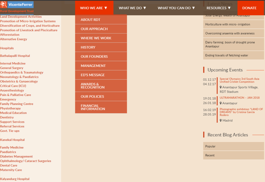
The number of pages and multi-level page hierarchy made content accessibility and discoverability a challenge, particularly when one of the goals of the client was to showcase the extensive work they were doing.
The left side menu and right sidebars added a lot of navigational links but narrowed the content area significantly. This reduce the room for displaying content effectively. It did not provide clear paths to finding information quickly either.
2. No Clear Call-to-Actions
The cluttered content and no clear call to action were resulting in lower donations through the website.
3. Website Security and Performance Issues
The client was hosted on a 2GB Virtual Private Server previously.
Our current website is heavy (for example, 55 plugins are installed, 18 of which are inactive). It takes time to respond and crashes often. We also think it is too textual and grades low in terms of design. We are currently assessing our communication strategy and we want the new website to align with it so that it can be an essential voice of our organisation and we can direct considerable traffic to it.
Judit Algueró, International Communications Coordinator
Customer Objectives from the new Website
Our current website is www.rdtfvf.org but it is not functional. We would like to duplicate our partner’s website in the USA www.vffusa.org (they will provide for the templates) and we need an agency like yours to help us with this process, adapting the structure of the site to our organisation. We would be looking to establish a relationship with an agency that can also take care of the site’s maintenance.
Judit Algueró, International Communications Coordinator
The client had the following priorities:
- Brand building (showcase our areas of work and our organisation)
- News and opinions
- Lead generation (newsletter sign-up)
- Online donation.
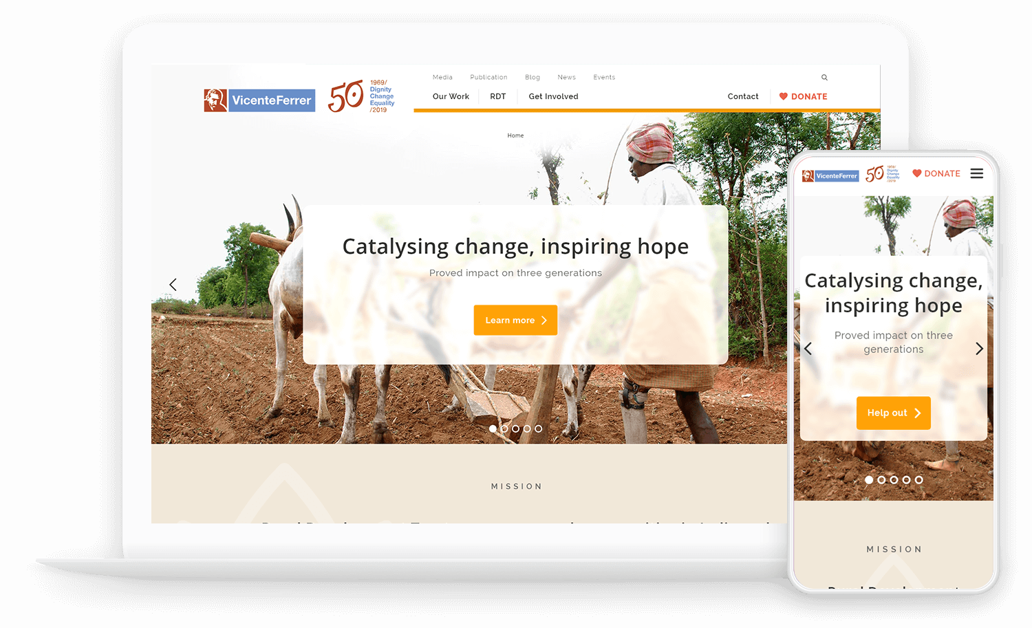
The initial plan was to replicate the design of their US foundation website. However, after analyzing the pros and cons, we decided to custom design it on WordPress.
Judit Algueró, International Communications Coordinator
We thought about duplicating our partner’s website https://vffusa.org/
PROS: It is in line with our corporate identity and has most of the sections we need. Clear and concise.
CONS: VFF USA focuses more on fundraising and RDT implements the programmes. The website is not very attractive. Lacks images or multimedia.
Website Redesign Solution
1. Content Organization
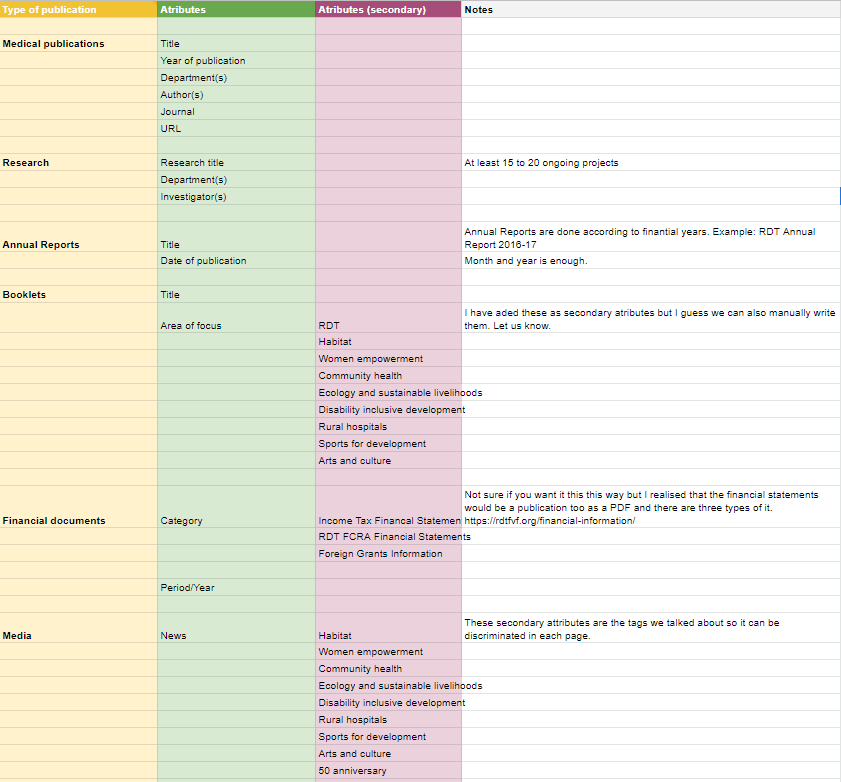
The first task was to organize the content. Since the old website had a lot of content and there was lots more in their repository, we had to do an audit to get the full picture. During the audit which the client did on our request, we categorized and tagged content.
Once the content was organized, we audited the pages on the old website and removed the unwanted ones. The content audit insights helped us map what content would go under which section of the new website.
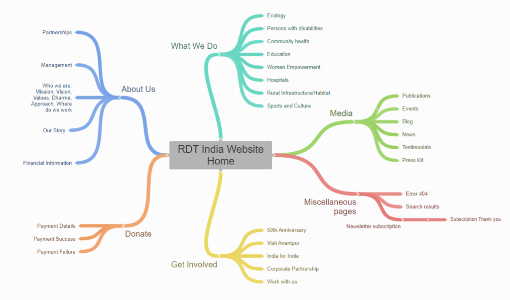
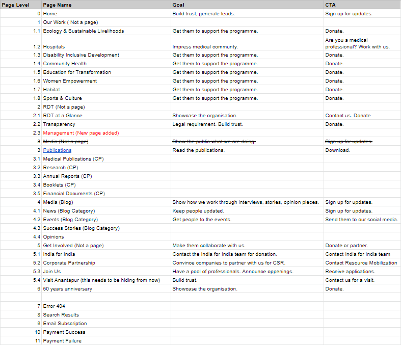
There was a lot of content in different formats under many categories. We decided to create WordPress Custom Post Types for some of them. This now provides two distinct advantages to the client:
- Easy management and uploading of content
- Better control in displaying and filtering content on the website
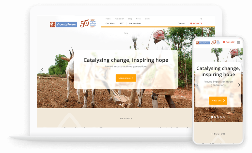
2. Website Design
The design had two challenges to overcome:
- Refresh the look and feel of the website, but keep it consistent with other websites used by the Spanish and German teams
- Create better user experience and provide an easier navigation experience
We followed a 3-step design process that included creating low-fidelity wireframes and then creating high-fidelity prototypes after feedback from the client.
With the work done previously in gathering, analyzing and organizing content, we then had to place them on the website. The copy for the website was to be provided by the client. To make their job easier, we created wireframes with guidelines on how much copy to be provided for each section. This was then incorporated into the website design.
This is tactic of collecting copy from clients for the website has been used successfully with our clients. It eliminates the trouble of trying to extract copy from a Word document and then trying to fit that into a design.
Sandeep Kelvadi, Head of Marketing, Pixelmattic
3. Secure, Performance-optimized & Donation-friendly WordPress Solution
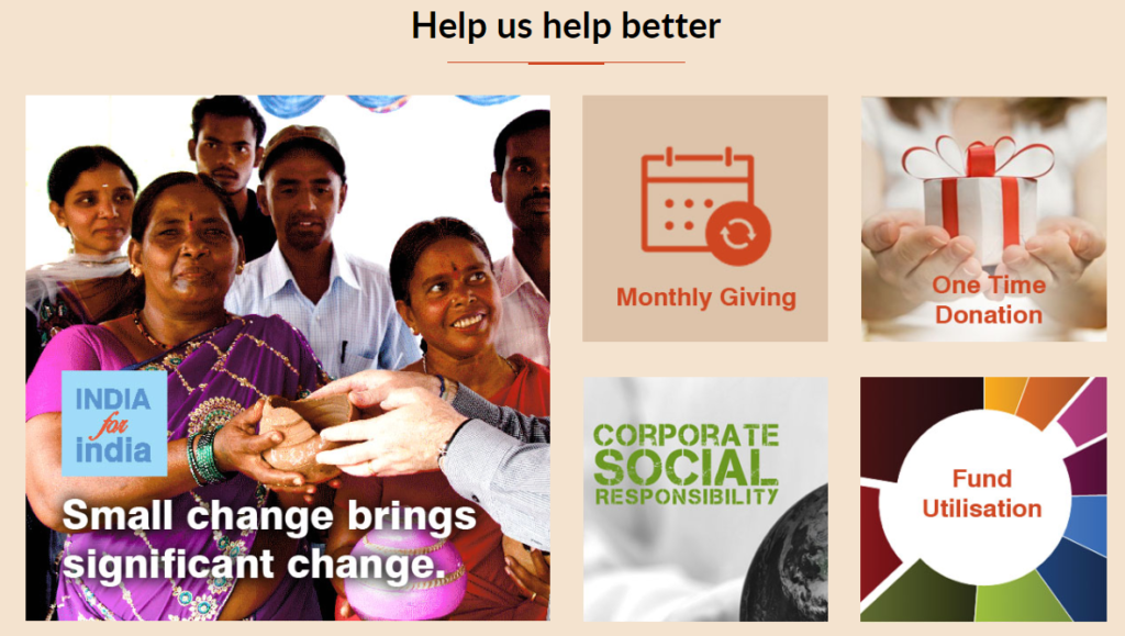
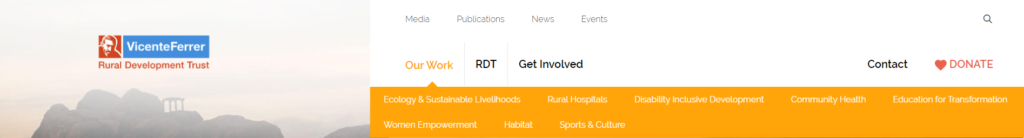
We added a clear call-to-action on every page to encourage donation. The Donate button was also made prominent in the sticky Menu bar.
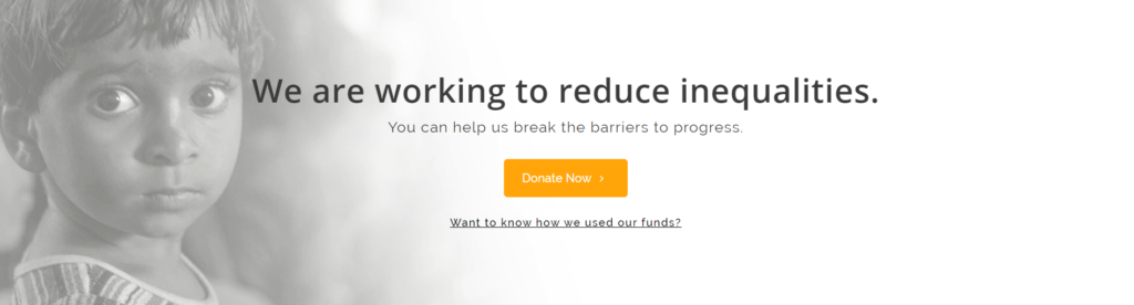
We did our research on what users look for on non-profit websites when it comes to donations. With this in mind, we add important information in vital places, like the “Want to know how we used our funds?” link just below the Donate button.
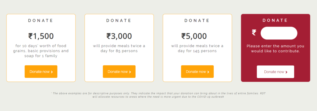
We provide an option to donate to specific causes without having to pick from a lot of options.
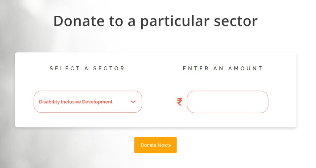
Or donate to a specific sector…
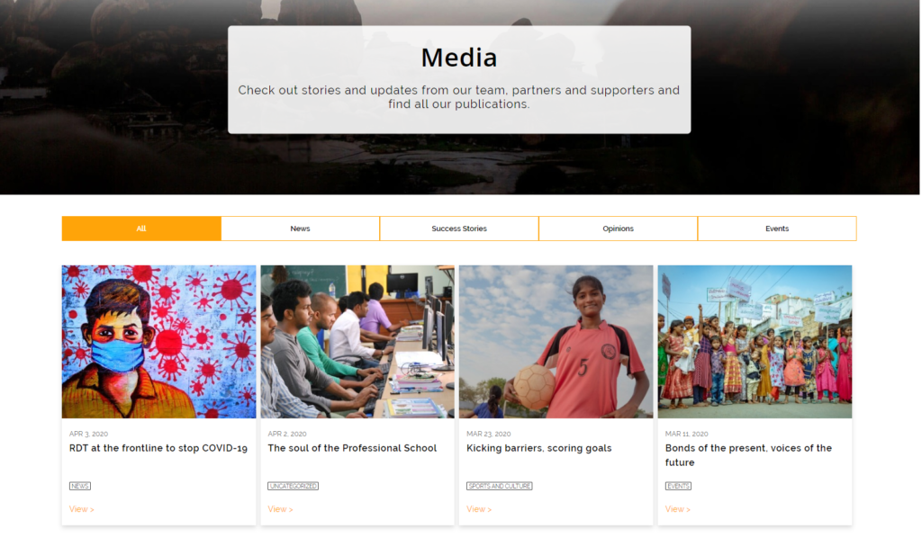
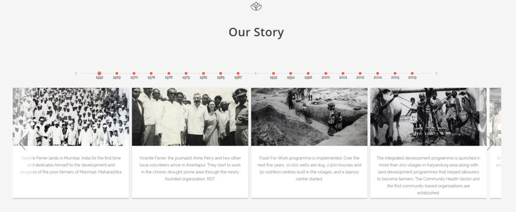
We implemented a timeline feature to showcase the history of the organization.
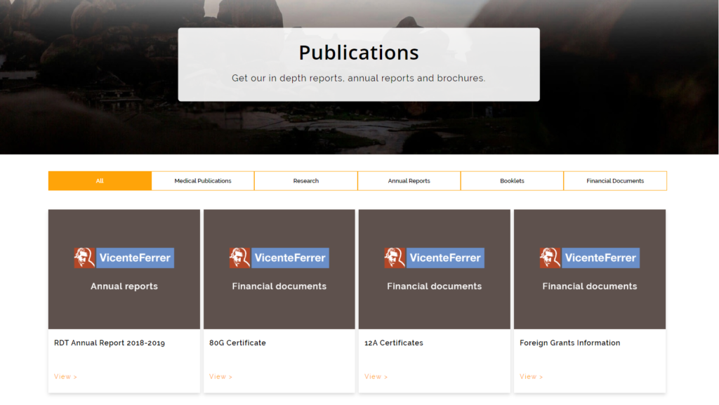
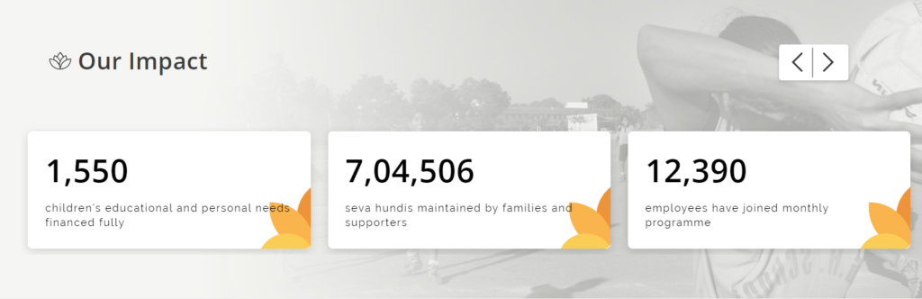
Keeping the goal of donations in mind, we built designed and built features on the website that displayed authenticity and social proof of the organization, like the stats slider here, testimonials and legally compliant documents for an NGO.
Finally, at the time of migration we had to find a solution to their hosting problems. The IT team was hesitant to move away from the VPS they were managing. However, given the security issues and frequent downtimes, we recommended and convinced the client to move to a reliable and stable WordPress hosting from Siteground.
Happy with our services, the client then signed on to our website care plans in May 2018 and we’ve been supporting them ever since.
Further Reading: Website Optimization Tips
Client Testimonial

Client Testimonial

Client Project
Check our other Casestudies
Efficiency on Wheels: Managing a Top-Tier EV...
Web Development and Optimization Services for a...